What Makes a Good AI-Generated T-Shirt Design? A Beginner's Guide
So you have discovered that AI can generate images, and now you want to slap one on a t-shirt. Fair enough. But there is a massive gap between "that looks cool on my phone screen" and "that actually works as a wearable design." Most people learn this the hard way, ending up with a murky blob on their chest that looked incredible as a 4K desktop wallpaper.
This guide will save you from that fate. Whether you are generating your own designs or browsing for AI-created tees, here is what separates the good from the forgettable.
Why AI T-Shirt Design Is Different from Regular AI Art
When you generate AI art for a screen, anything goes. Hyper-detailed landscapes, photorealistic portraits, intricate fractal patterns -- they all look stunning at full resolution on a monitor. But a t-shirt is not a monitor.
Fabric has texture. Prints have size limits. People see your shirt from a few metres away, not zoomed in on a 27-inch display. The best AI t-shirt designs account for this from the start, not as an afterthought.
That means your approach to prompting needs to shift. You are not creating gallery art. You are creating something that communicates at a glance, holds up at arm's length, and still looks sharp after a few washes.
The Anatomy of a Great AI T-Shirt Prompt
Be Specific About Style
"Cool dragon" is not a prompt. It is a wish. AI models respond dramatically to style keywords, and the difference between a vague prompt and a targeted one is the difference between a generic clip-art dragon and something people actually compliment.
Here are some style keywords that tend to produce strong t-shirt designs:
- Chibi -- cute, exaggerated proportions, bold outlines. Perfect for character-based designs.
- Vector art -- clean lines, flat colours, scales beautifully for print.
- Cartoon -- expressive, fun, reads well from a distance.
- Sticker style -- bold outlines with a slight 3D pop. Great for centred chest prints.
- Retro/vintage -- gives that worn-in, thrift-shop feel people love.
Compare these two approaches:
Mediocre prompt: "a vampire ghost"
Better prompt: "chibi vampire ghost character, cute gothic style, simple background, bold outlines, sticker art"
The second one gives the AI actual direction. And the results speak for themselves:
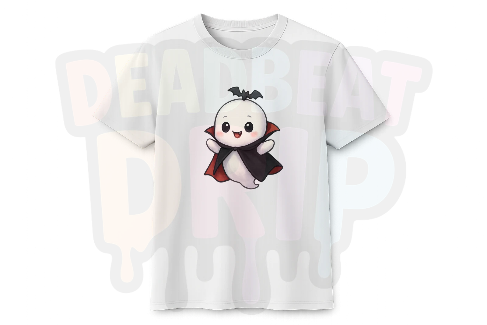
That Chibi Vampire Ghost reads instantly. You know what it is from across the room. That is what you want from a t-shirt design.
Think About Negative Space
A common beginner mistake is generating a full scene -- background, foreground, lighting, the works -- and trying to print that on a shirt. The result is a rectangle of colour slapped onto fabric. It looks like someone ironed a postcard onto their chest.
The best AI t-shirt designs float. They have a clear subject with transparent or minimal background. When you are prompting, phrases like "isolated character," "white background," "no background," or "sticker style" help push the AI toward designs that work as standalone elements on fabric.
Bold Over Detailed
Here is a rule that will serve you well: if you squint and the design disappears, it will not work on a shirt.
Fine lines, subtle gradients, and intricate micro-details get lost in the printing process. What works is boldness. Strong outlines, saturated colours, clear shapes. Look at how well these character designs hold up:
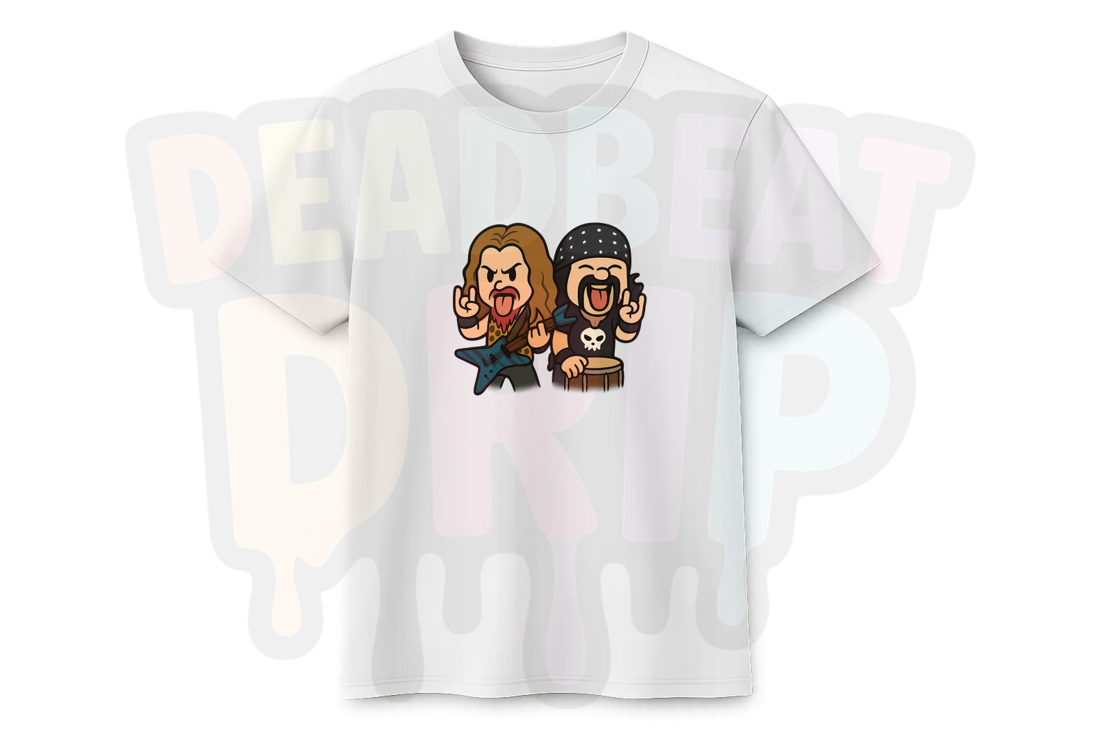
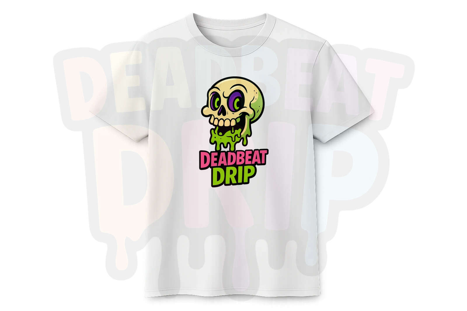
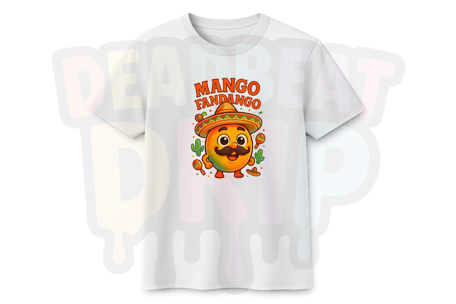
Every one of these has clear shapes, strong colour, and reads well at any size. The Chibi Metal Legends piece packs multiple characters in without becoming muddy. The Deadbeat Drip skull is simple but punchy. Mango Fandango is pure character design done right.
Colour Considerations (They Matter More Than You Think)
Design Colours vs Shirt Colours
This trips people up constantly. A design with lots of white in it looks brilliant on screen but becomes invisible on a white shirt. A dark, moody design vanishes on a black tee.
Think about contrast. If you are designing for a white shirt, make sure your design has strong darks and saturated colours. For black shirts, bright and vivid elements pop the hardest.
Keep the Palette Tight
Designs with fifteen different colours tend to look chaotic on fabric. The strongest t-shirt art usually sticks to a limited palette -- three to five main colours with good contrast between them. This is another area where style keywords help: "limited colour palette," "flat colours," or naming specific colours in your prompt gives the AI guardrails to work within.
What Actually Works on Fabric vs Screen
Here is a quick cheat sheet based on what we have seen work best at Deadbeat Drip:
Works brilliantly on fabric:
- Character designs with bold outlines
- Cartoon and chibi styles
- Text-based designs with chunky lettering
- Isolated subjects on clean backgrounds
- Designs with 3-5 strong colours
Looks great on screen, disappointing on fabric:
- Photorealistic portraits (too much fine detail)
- Full scene landscapes (rectangle-on-shirt problem)
- Designs relying on subtle gradients
- Anything where the magic is in the tiny details
- Dark designs intended for dark shirts
The "Would I Notice This?" Test
Before you commit to printing any AI design on a t-shirt, try this: shrink the image to thumbnail size on your phone. Can you still tell what it is? Does it still look good? If it passes the thumbnail test, it will probably look great on a shirt.
If it becomes an indistinct blob at small sizes, it needs more contrast, bolder lines, or a simpler composition.
Quick-Start Prompt Formula
If you are brand new to this, here is a reliable formula to get you started:
[Subject] + [Style] + [Mood/Vibe] + "isolated on white background, bold outlines"
Examples:
- "Grumpy cat wearing a tiny crown, chibi style, sassy vibe, isolated on white background, bold outlines"
- "Retro robot eating pizza, cartoon style, fun and colourful, sticker art, white background"
- "Gothic teddy bear with bat wings, cute horror style, limited colour palette, isolated character"
You will not nail it every time. That is fine. AI image generation is iterative -- you tweak, regenerate, and refine. But starting with a solid prompt structure puts you miles ahead of "cool dragon."
See What Good AI T-Shirt Design Looks Like
The best way to develop an eye for what works is to look at designs that are already hitting the mark. Browse our store and pay attention to what catches your eye. Notice the style choices, the colour palettes, the way the best designs communicate instantly.
Browse AI-Generated DesignsEvery design on Deadbeat Drip is a one-of-a-kind AI creation. No templates, no stock graphics, no mass-produced clip art. Just genuinely unique art that actually works on fabric. Have a look around -- and if something catches your eye, it is probably because it follows exactly the principles we just covered.